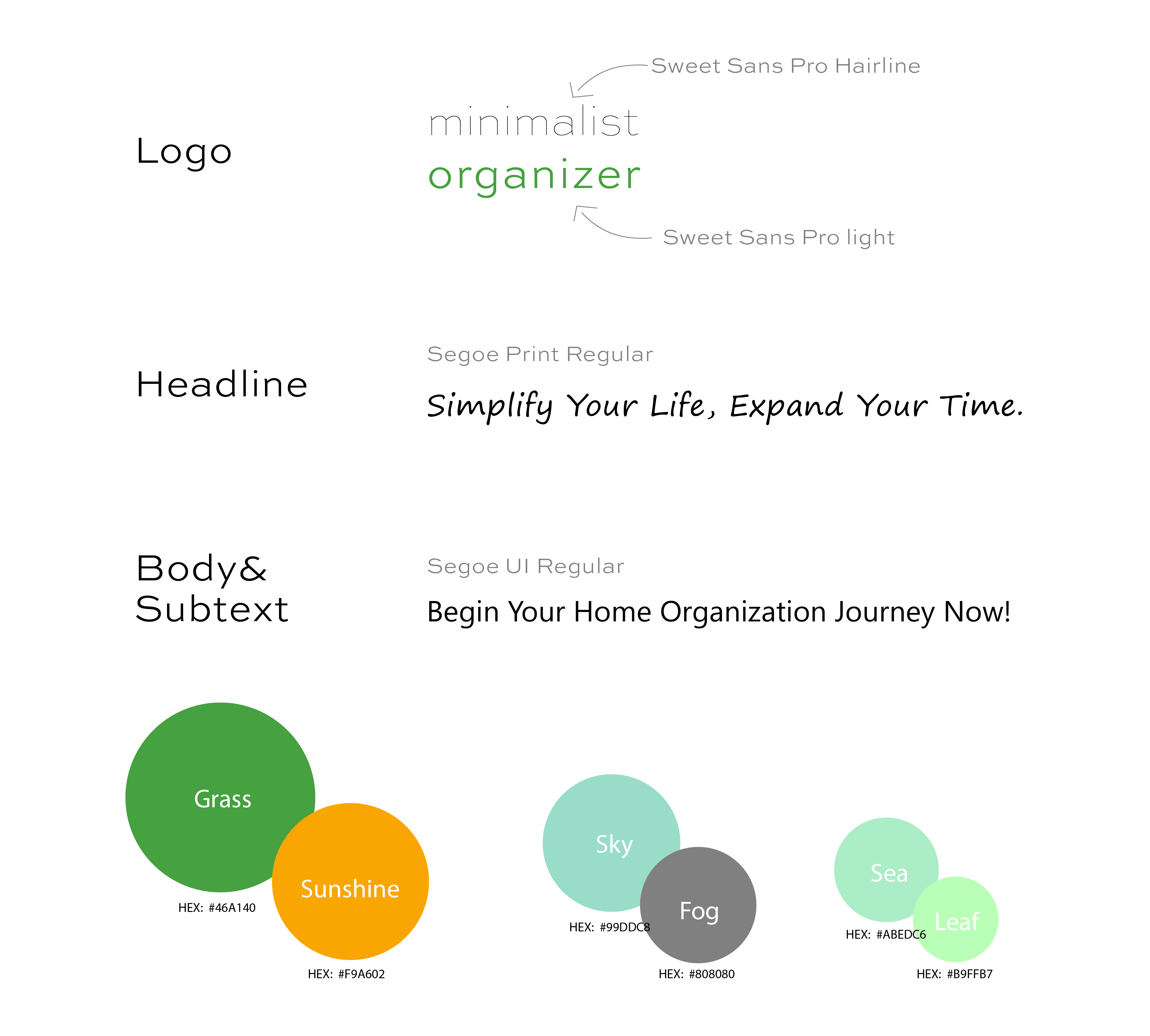
Logo System
The logo system includes variations depending on the use case, which includes: website, social media and print. The symbol of the empty home represents openness and the leaf stamped on it symbolizes a natural change, improving your home to reflect who you are at your core. The weight on the typeface differs to highlight the meaning of the word "minimalism."
Color
The color palette was inspired by colors you find in nature. The stark difference in colors helps to distinguish each individual element, while maintaining the same unifying theme, nature. The elements represent the diverse sections of a home working together in a cohesive manner.
Type
The logo uses "Sweet Sans," which is a Sans Serif typeface. It has wide letterform, which is visible at small sizes. The logo utilizes two of the nine weights available.
For the headline and body, "Segoe" is used. It is a Sans Serif typeface as well. Segoe Print is used as a fun handwritten way to leave a note like message in the headline. Segoe UI Regular is used for the body and sub-text. It is a widely known font used by Microsoft across its' many products, so it brings some familiarity to the brand.
Business Card
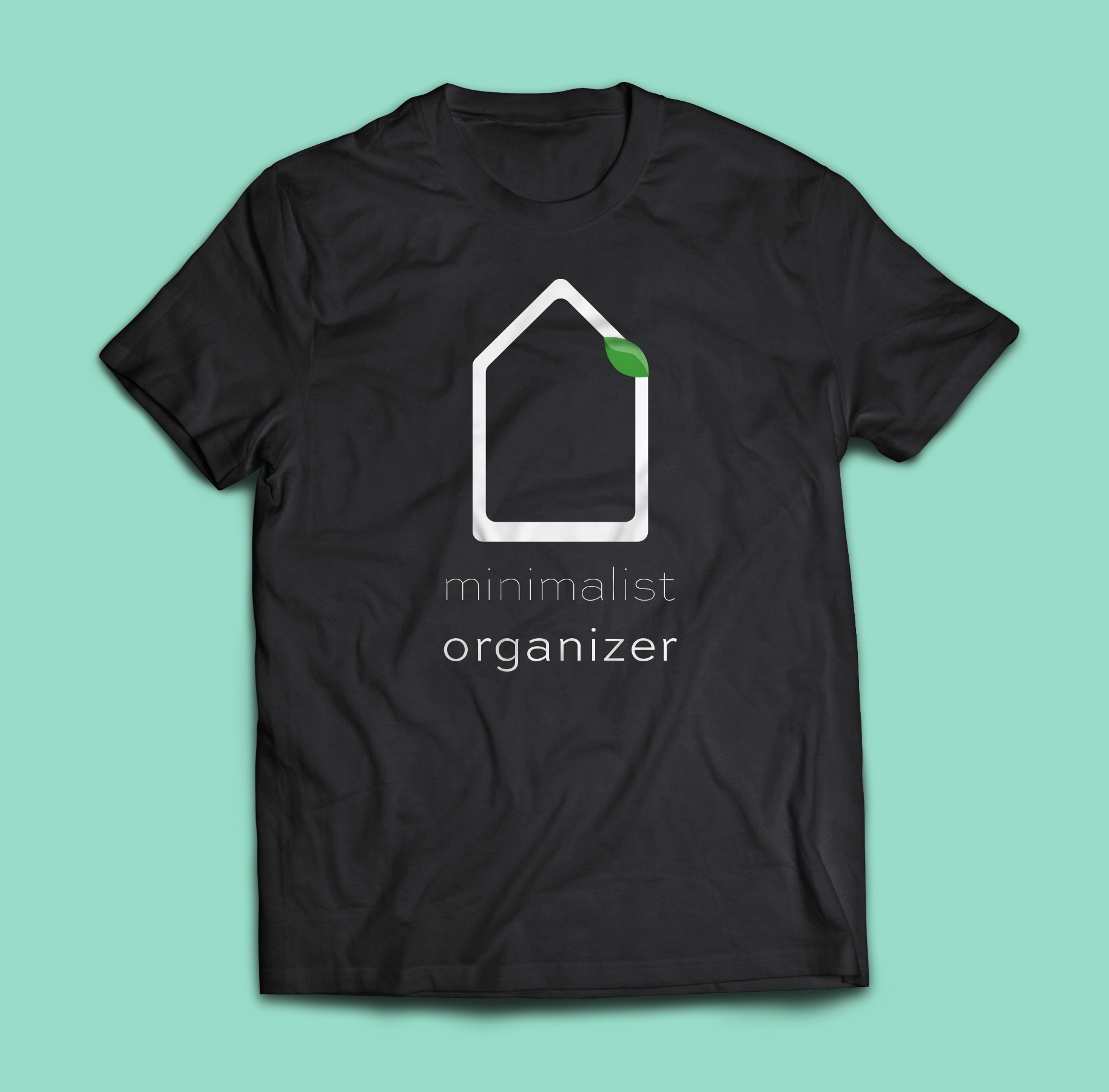
Brand Merch